Beyond automatic accessibility testing: 6 things I check on every website I build
posted on
I just finished an accessibility audit for a client and I decided to share some quick checks I perform in every site I audit and build. It’s something that you can apply to your project right away, you don’t have to learn a tool or a software.
Step 0: Automatic tests
The first thing I do is run accessibility checks in Lighthouse to figure out if anything obvious is wrong. Automatic accessibility tests are great but they only check a subset of what needs to be tested. If you have a score of 100 or 0 errors, you’re not done. It just means you’ve laid the groundwork for manual testing.
Step 1: Check image descriptions
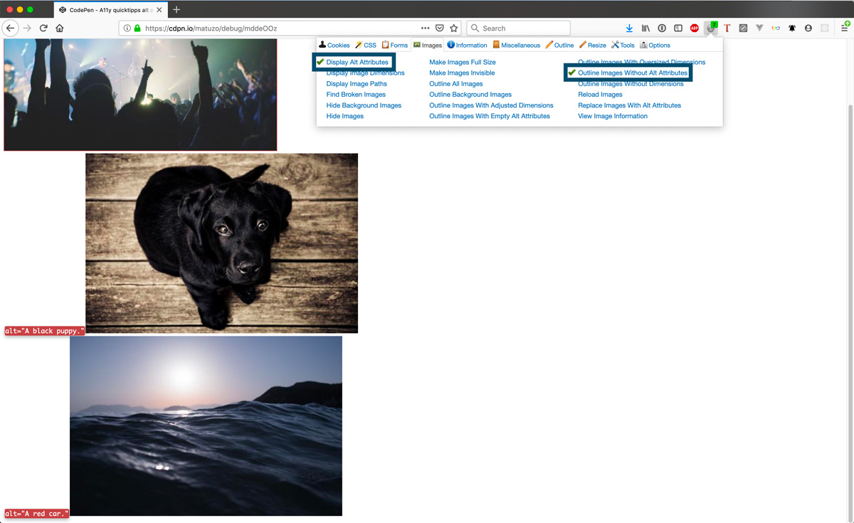
The first semi-manual test I perform is check if images have descriptions and if they’re described correctly. I’m using a browser extension called Web Developer for that. You can highlight images that have no alt attribute or display the value of alt attributes next to images.

Step 2: Disable all styles
Another feature of the Web Developer extension is the ability to disable CSS on a page. If you disable CSS, you’re able to check various things.
- Does the website work without CSS (in case it doesn’t load)?
- Does the order of elements of your page make sense?
- Are images and icons sized correctly?
- Is your document well structured?

Step 3: Validate HTML
You can use the W3C Markup Validation Service to check your markup. The Validation Service doesn’t catch everything, but it’s great for finding obvious bugs in your HTML, like duplicate ids or broken aria references.

Step 4: Check the document outline
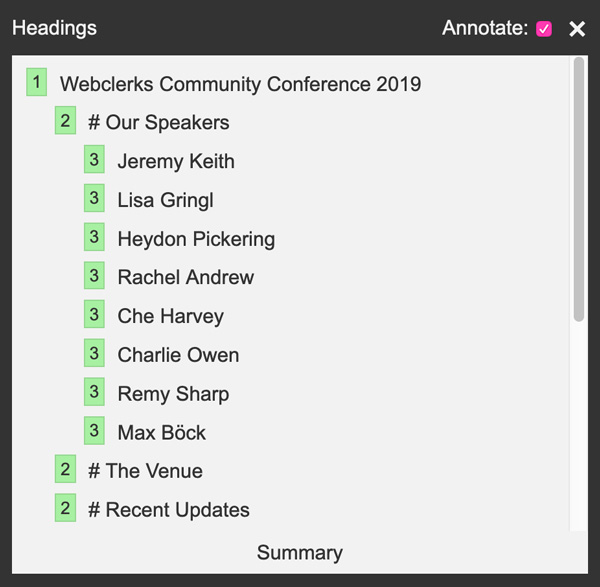
A sound document outline is important. It should start with a h1 followed by h2, h3, etc. in hierarchical order. This is great for search engines and screen reader users because they might navigate your site by jumping from one heading to another.

You can use the W3C Markup Validation Service to check your outline or a tool called tota11y (as seen in the screenshot above).
Step 5: Grayscale mode
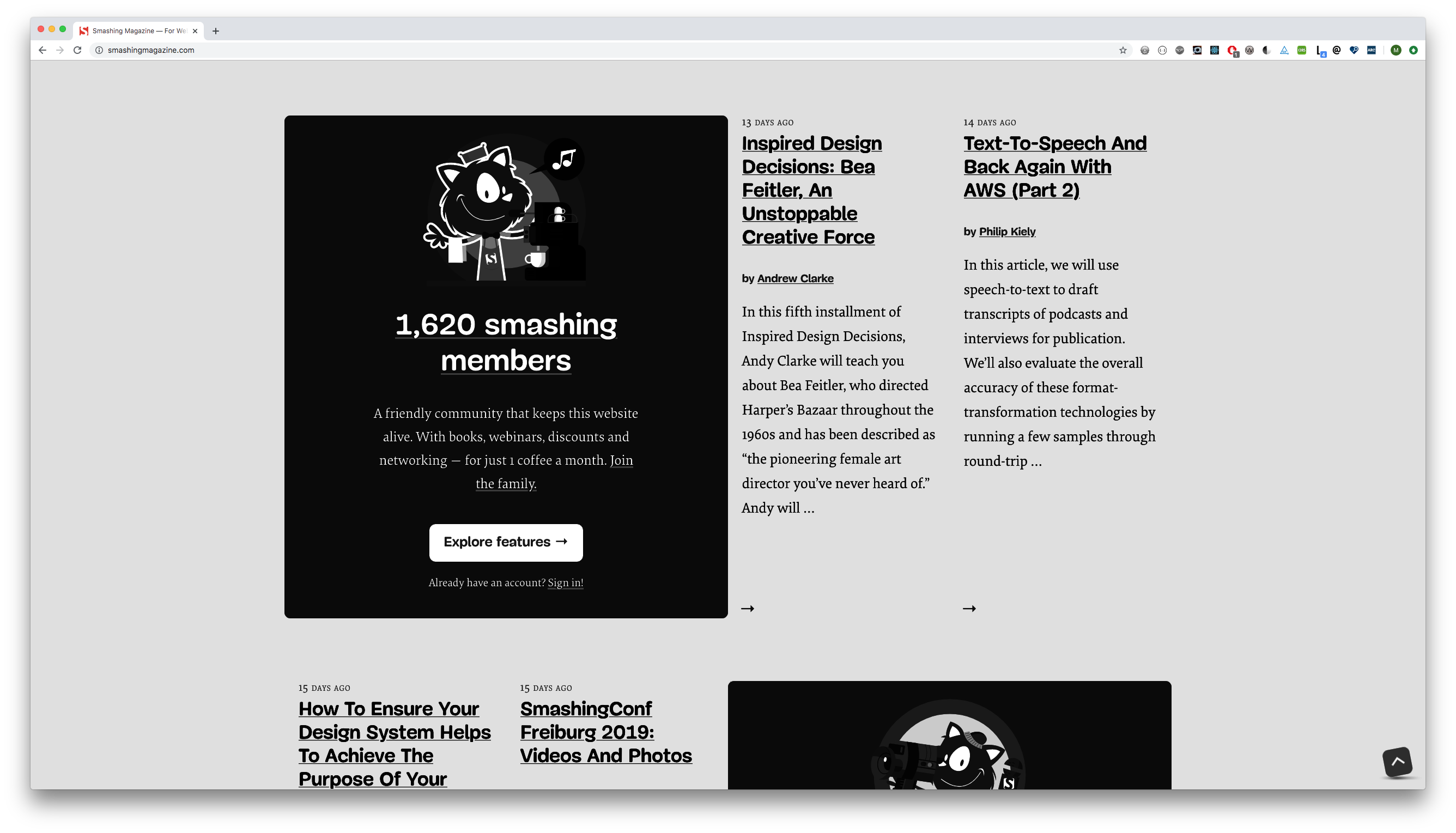
I’m using a browser extension called High Contrast to display sites in grayscale mode.\
This is an important check because it will tell you if parts of your design work with color only. You should make sure you don’t convey information with color alone. A perfect example are links, they should have underlines to easily differentiate them from normal text. Underlines are beautiful!
Underline your fucking links you sociopaths.
- Heydon Pickering

You don’t have to install a browser extension, you can also use CSS to achieve a similar effect.
body {
  filter: grayscale(100%);
}
Step 6: Use the keyboard
Put your mouse away and tab through the page and see if you can use every single part of the site without a mouse/touch pad. The tab key is a powerful testing tool, it will tell you a lot about your site:
- Are focus styles clearly visible?
- Is everything focusable that should be?
- Are your buttons real
<button>s? - Is the overall UX using a keyboard great?
- Are you managing focus correctly?
- Do you hide and show elements correctly?
- Does visual order match DOM order?
- Can you use custom JS components without a mouse?
There’s even a npm package for disabling the mouse cursor, built by the wonderful Marcy Sutton.
That’s not the end of the story. There are more things that you should check, but that’s it for now. I’ll share more in another post. :)