Totally remdom, or How browsers zoom text
posted on
tl;dr
I've compared px and rem in Chrome macOs, Firefox macOs, Safari macOs, Safari iOS, Chrome Android, and Firefox Android. Of those six browsers, only Chrome and Firefox on macOS differentiate between rem and px-based values. All the others do their own thing.
Last week, I lied to my students. After I explained how the rem unit worked, I told them that they could compare px and rem by increasing the font size in their mobile browsers and see how it affects text zoom.
Before I said that, we created a simple test page with two paragraphs and two rules.
HTML
<p class="px">Hello World!</p>
<p class="rem">Hello World!</p>
CSS
.px {
font-size: 16px;
}
.rem {
font-size: 1rem;
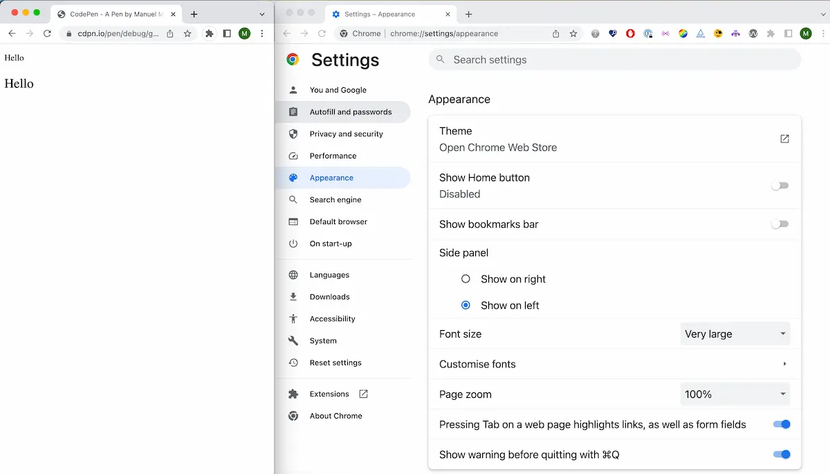
}Then, we opened the settings in Chrome, found the Appearance page, and changed the font size from medium to very large. The font size of the second paragraph, which uses rem, increased with the default font size in the browser. The first paragraph, which uses px, stayed the same.
You can do the same in Firefox by visiting the General page in the browser settings, finding the Fonts section, and picking a font size larger than 16 in the size dropdown.
In Desktop Safari, you can define a minimum font size under Settings - Advanced - Accessibility, but it doesn't make a difference whether you use rem or px.
That's how I proved to them that using rem is a good idea because it respects user preferences and allows the UI to scale with the default font size set in the browser.
Mobile browsers
I'm currently writing the Accessibility Cookbook for O'Reilly, and I wanted to give my readers the same advice but with a bit more detail.
Here's what I learned about rem and mobile operating systems and browsers:
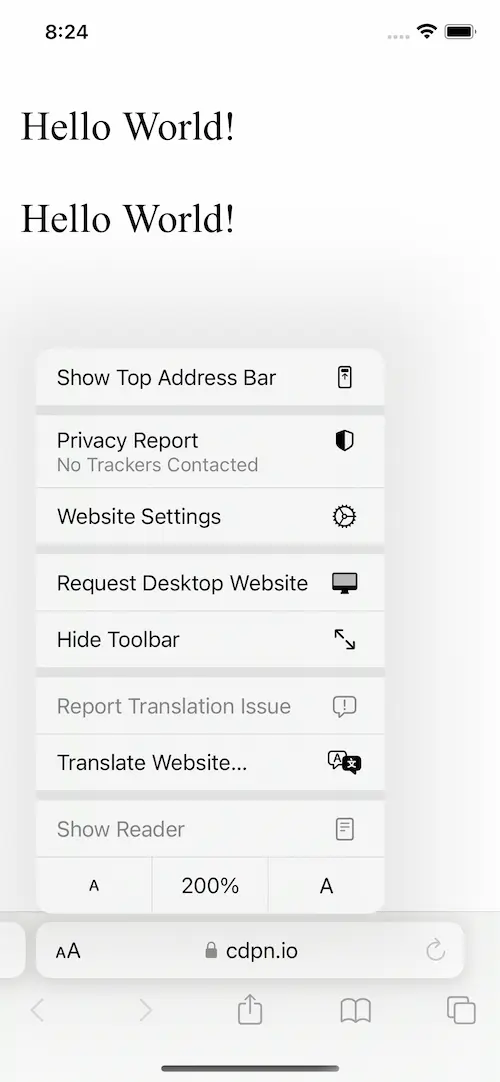
Safari
In Safari, you can zoom the entire page by going to Settings - Safari - Page Zoom. Another option is to click the “small A Large A” icon in the address bar directly in Safari, as shown in the following screenshot. There, you can zoom text only instead of the entire page.
However, both settings treat px and rem-based values equally.
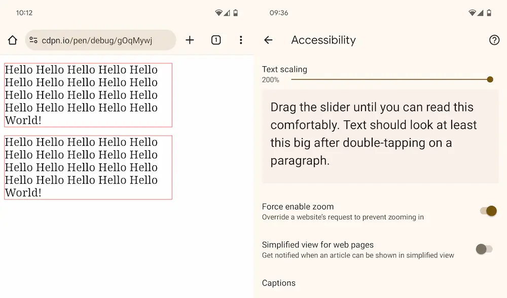
Chrome on Android
In Chrome on Android, you can click on the three dots (kebab icon) next to the address bar and select Settings - Accessibility. There, you can change the text scaling.
I did that, and nothing happened on my test page. It did work on my personal site, though,...partially (we'll talk about that later).
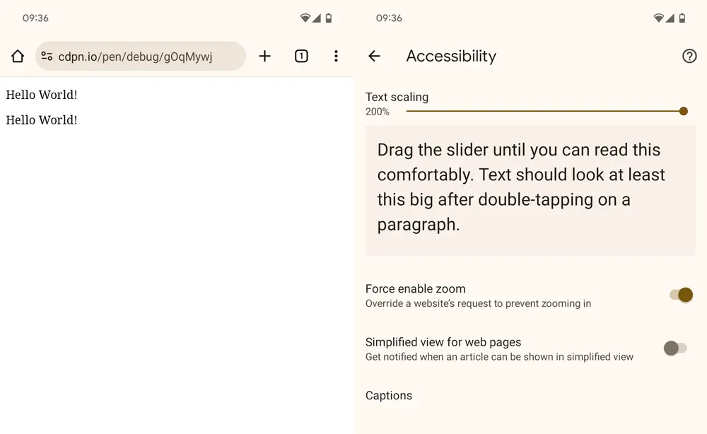
I did some debugging, and I learned that Chrome's text scaling only kicks in when there are at least 122 characters on the page (FFS!).
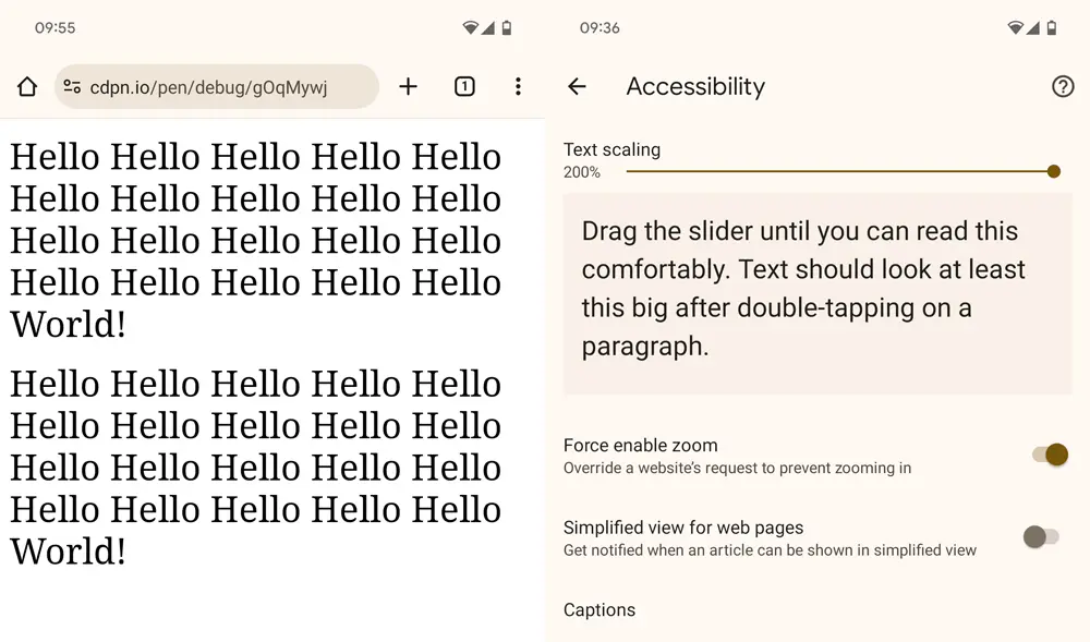
Retrying the test with more than 122 characters shows that Chrome also treats rem and px-based font sizes equally.
Of course, we don't just use rem for text sizing only. When you add a width to each paragraph, the second paragraph should be larger than the first if the base font size is larger than 16px.
.px {
  font-size: 16px;
  border: 1px solid red;
  width: 320px;
}

.rem {
  font-size: 1rem;
  border: 1px solid red;
  width: 20rem;
}
Nope, both paragraphs have the same width, but the text got smaller. Why? Because text scaling on mobile Chrome is an unpredictable mess.
Just look closely at my site, with text scaling set to 200%. Are you noticing anything? The text in the nav didn't scale. Wanna know why? Because I set display: flex on the ul. WTF?!

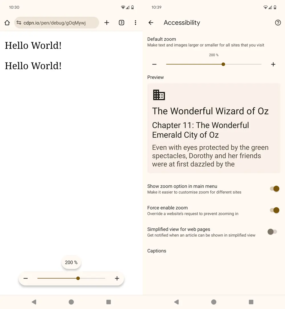
There's more strange stuff I found, but I'll spare you the details because it's just too messy. Also, text scaling in Chrome should improve in an upcoming version, according to a post on the Google blog. It's from February 2023, and according to how they announced the feature, I would've expected it had already landed, but I don't see it on my phone (Pixel 7, Android 13, Chrome 118).
You can enable it by navigating to chrome://flags, searching for zoom, and enabling Accessibility Page Zoom. Now, all the bugs (features!?) mentioned earlier don't apply anymore, but Chrome still treats px and rem the same.
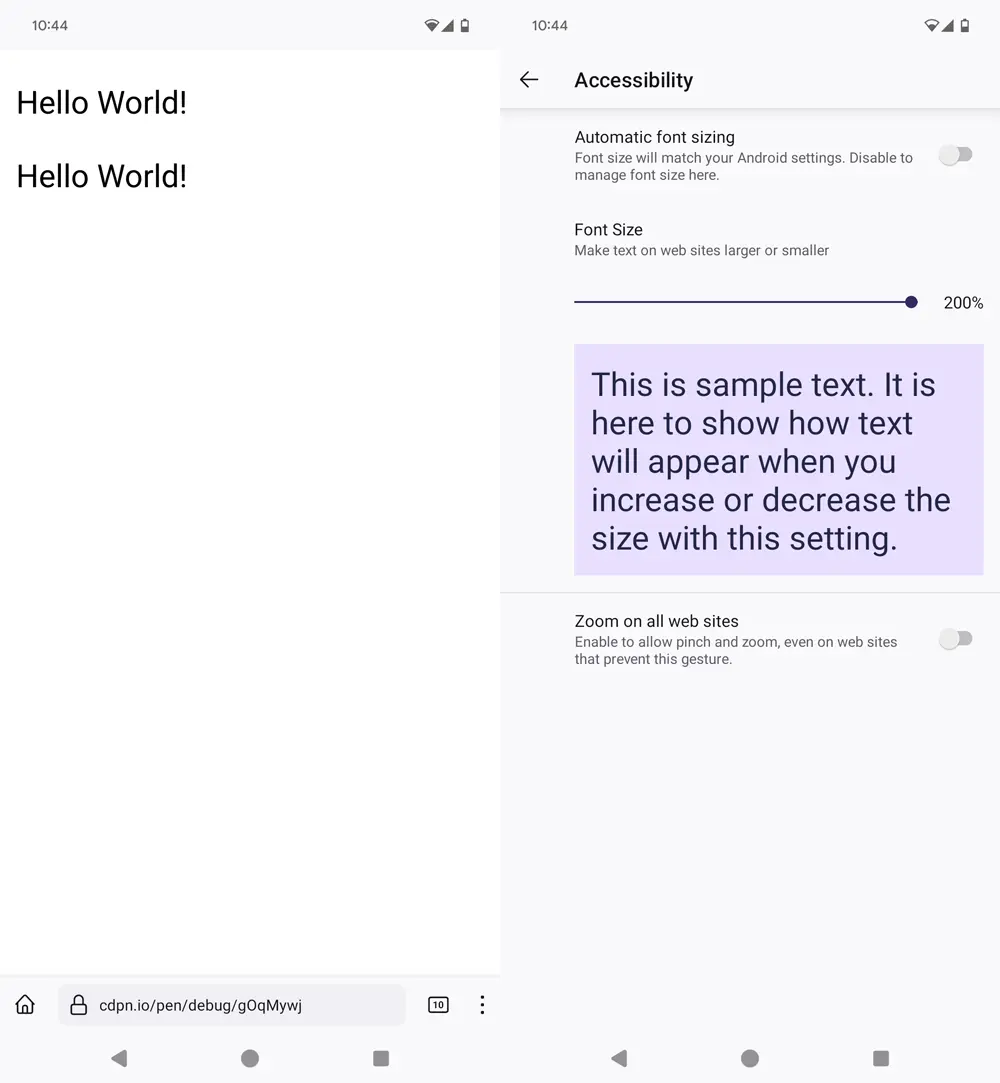
Firefox on Android
In Firefox on Android, you can click on the three dots (kebab icon) next to the address bar and select Settings - Accessibility. There, you can change the text scaling. It works like the improved text scaling feature in Chrome and treats px and rem equally.
So what?
Nothing, keep using rem. People will benefit from it. It's just good to know that some (most?) operating systems and browsers do their own thing. Ultimately, it doesn't matter how browsers zoom text; what matters is that users can use that feature and that you build interfaces that respect user preferences. Part of that is working with relative units like rem.
One more thing: it's absolutely possible I'm wrong about some things because I don't know the ins and outs of all mobile operating systems and browsers. If that's the case, please correct me via email (manuel@matuzo.at) or find me on Mastodon. :)