Day 72: the masonry-auto-flow property
posted on
It’s time to get me up to speed with modern CSS. There’s so much new in CSS that I know too little about. To change that I’ve started #100DaysOfMoreOrLessModernCSS. Why more or less modern CSS? Because some topics will be about cutting-edge features, while other stuff has been around for quite a while already, but I just have little to no experience with it.
If you’re creating a masonry layout, the packing algorithm puts items into the column with the most space by default. This can cause accessibility issues. The masonry-auto-flow property gives us control over the automatic placement of items in a masonry layout.
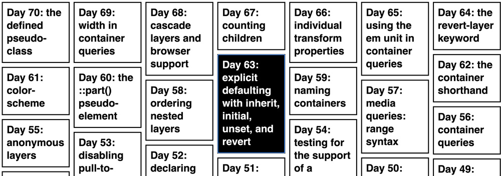
In the following layout, you can see how the tile for “Day 63” is placed in the middle column. Since day 64 is in the last column of the first row, you’d expect day 63 to be in the first column of the second row. If you compare the heights of the items in the first column, you can see that the middle column is the one with the most available space. That’s why the algorithm placed day 63 there.
ol {
  display: grid;
  gap: 1rem;
  grid-template-columns: repeat(auto-fill, minmax(16.5rem, 1fr));
  grid-template-rows: masonry;
}
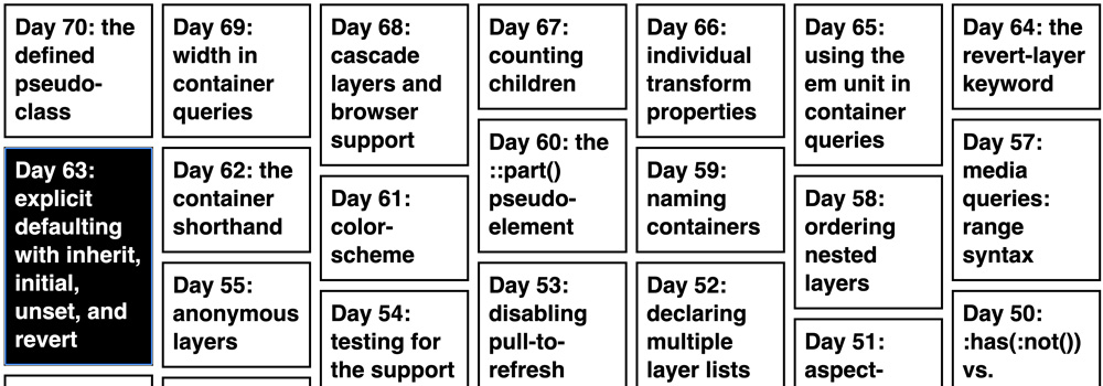
It’s hard to orientate and understand how the layout is structured, if the placement is completely random. By setting masonry-auto-flow to next, we can instruct the browser to place items one after the other on the grid axis.
ol {
  display: grid;
  gap: 1rem;
  grid-template-columns: repeat(auto-fill, minmax(16.5rem, 1fr));
  grid-template-rows: masonry;
  masonry-auto-flow: next;
}
Note: Firefox is the only browser that supports the keyword at the moment and the feature is still behind a flag. You can enable it by visiting `about:config` and setting `layout.css.grid-template-masonry-value.enabled` to `true`.
Overview: 100 Days Of More Or Less Modern CSS