Day 38: vh, svh, lvh, and dvh
posted on
It’s time to get me up to speed with modern CSS. There’s so much new in CSS that I know too little about. To change that I’ve started #100DaysOfMoreOrLessModernCSS. Why more or less modern CSS? Because some topics will be about cutting-edge features, while other stuff has been around for quite a while already, but I just have little to no experience with it.
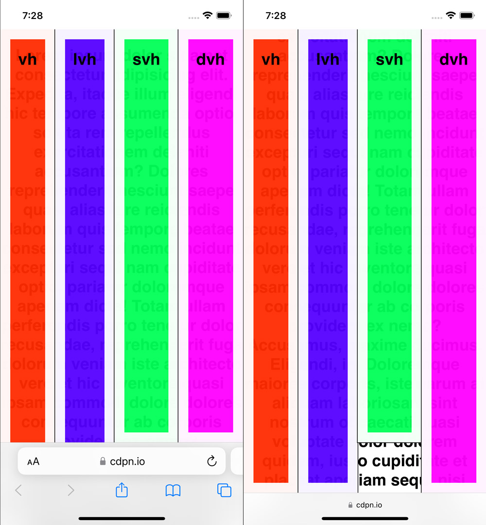
Using the viewport unit vh in desktop browsers is usually straight-forward, 100vh matches the height of the viewport. On mobile that's different because the viewport height changes depending on whether or not certain user interface elements are visible, 100vh doesn't always match the height of the viewport.
On mobile we have the small viewport and the large viewport. According to the spec, the small viewport is the viewport sized assuming any UA [User Agent/Browser] interfaces [for example the address bar] that are dynamically expanded and retracted to be expanded
.
The large viewport is the viewport sized assuming any UA interfaces that are dynamically expanded and retracted to be retracted
.
The problem with 100vh on mobile is that it doesn’t respect whether user interface elements are expanded or not. It usually always matches the large viewport. CSS introduces new viewport units to address that issue.
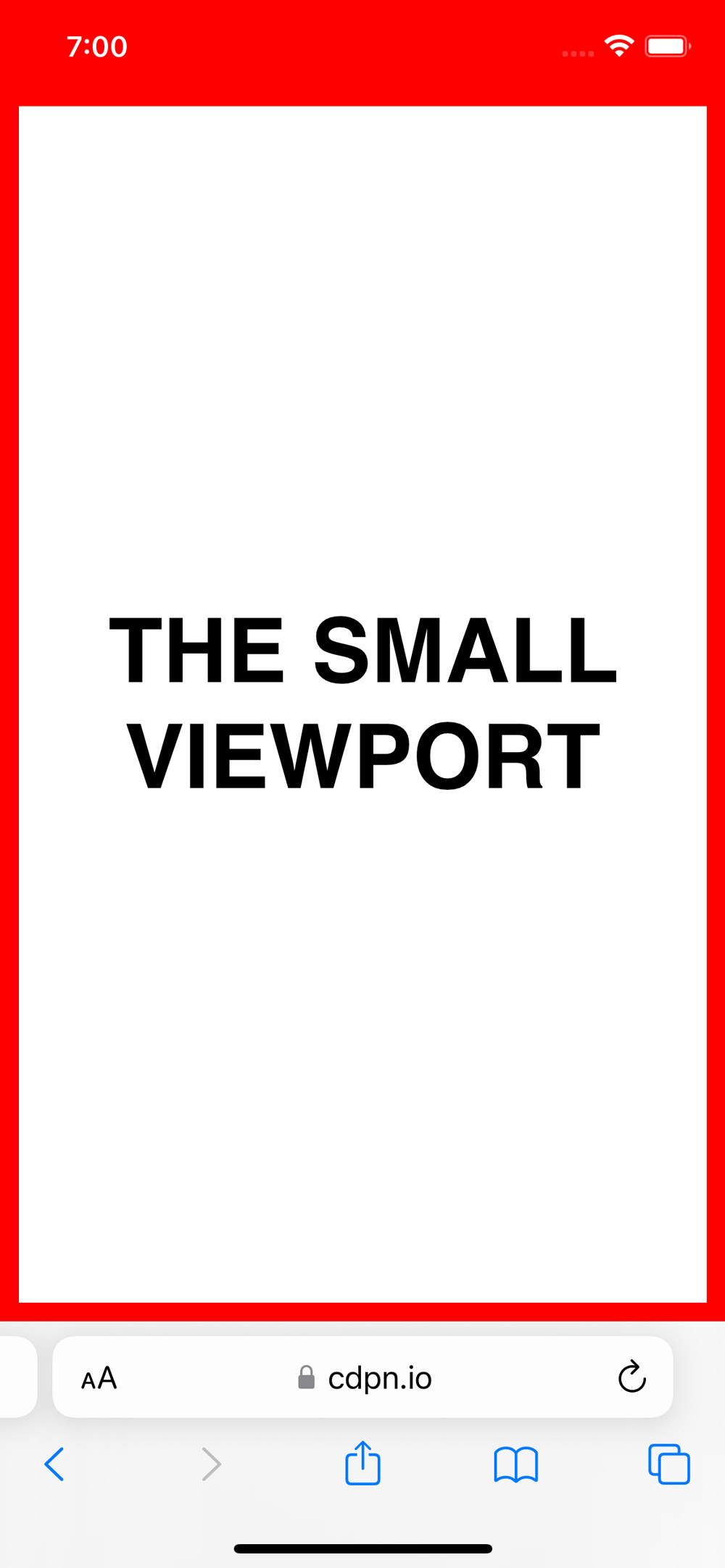
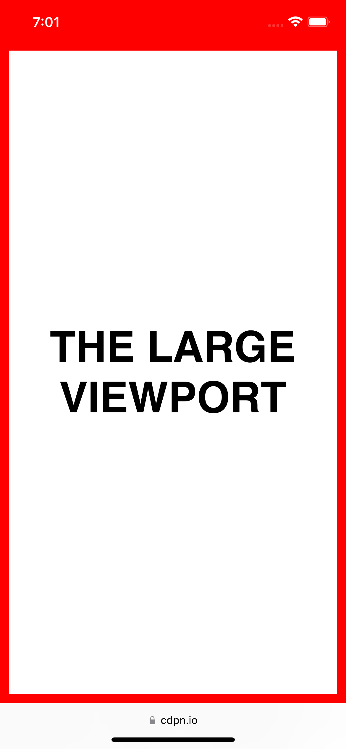
You can use svh for the small viewport and lvh for the large viewport.
div {
  height: 100svh;
  /* See result in the first screenshot */
}
div {
height: 100lvh;
/* See result in the second screenshot */
}That's great, but depending on if and how the user interacts with the page, they might sometimes see the large viewport and sometimes the small viewport. Setting the height to either unit probably isn't what you want because the height changes dynamically. Instead, you want to use the third new unit dvh, which dynamically either matches svh or lvh.
div {
  height: 100dvh;
}
Further reading
- It's viewports all the way down | HTTP 203
- 6.1.2.1. The Large, Small, and Dynamic Viewport Sizes
- Large, Small, and Dynamic viewport units (caniuse)
Overview: 100 Days Of More Or Less Modern CSS