12 Tips for More Accessible React Apps (Slides, React Finland 2019)
posted on
If you want to improve the accessibility of your React apps but you don't know how or where to start, this talk is just what you need. Manuel shares 12 tips that will help you build web sites and applications that can be used by anyone. Each tip fits on one slide and you'll be able to put them into practice right away without having to learn anything fundamentally new. The tips include testing, HTML, JS techniques, and general best practices.
Recording of the talk
Slides
The slides are online on this page slide by slide with descriptions.
Introduction

Hello React Finland!
About me

My name is Manuel Matuzovic, I'm a frontend developer from Vienna.
I work for the City of Vienna and I'm specialised in HTML, CSS, and accessibility.
Link to the Slides
The slides for this talk are already online if you want to follow along on your laptop.
I'm not a React developer but I know how awesome React is. Today I'm here to give you tips that will help you create better apps and reach more people.
About this talk
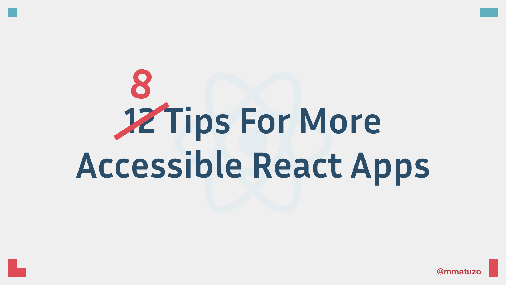
This talk is called 12 Tips For More Accessible React Apps. At the time when I picked the title I didn’t know how much time I will have so I just picked an arbitrary number and I thought that 12 will be fine.
As it turns out, I only have 20 minutes so let’s get started with my 8 tips for more accessible react apps. 😄
a11y tip #1: Create a sound document outline
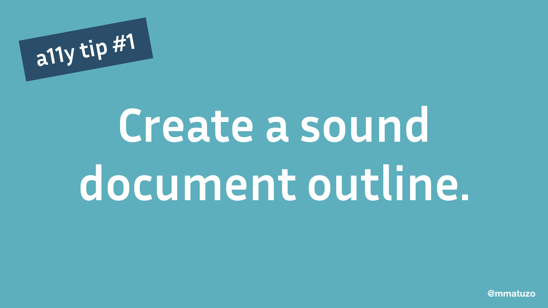
My first tip is: Create a sound document outline.
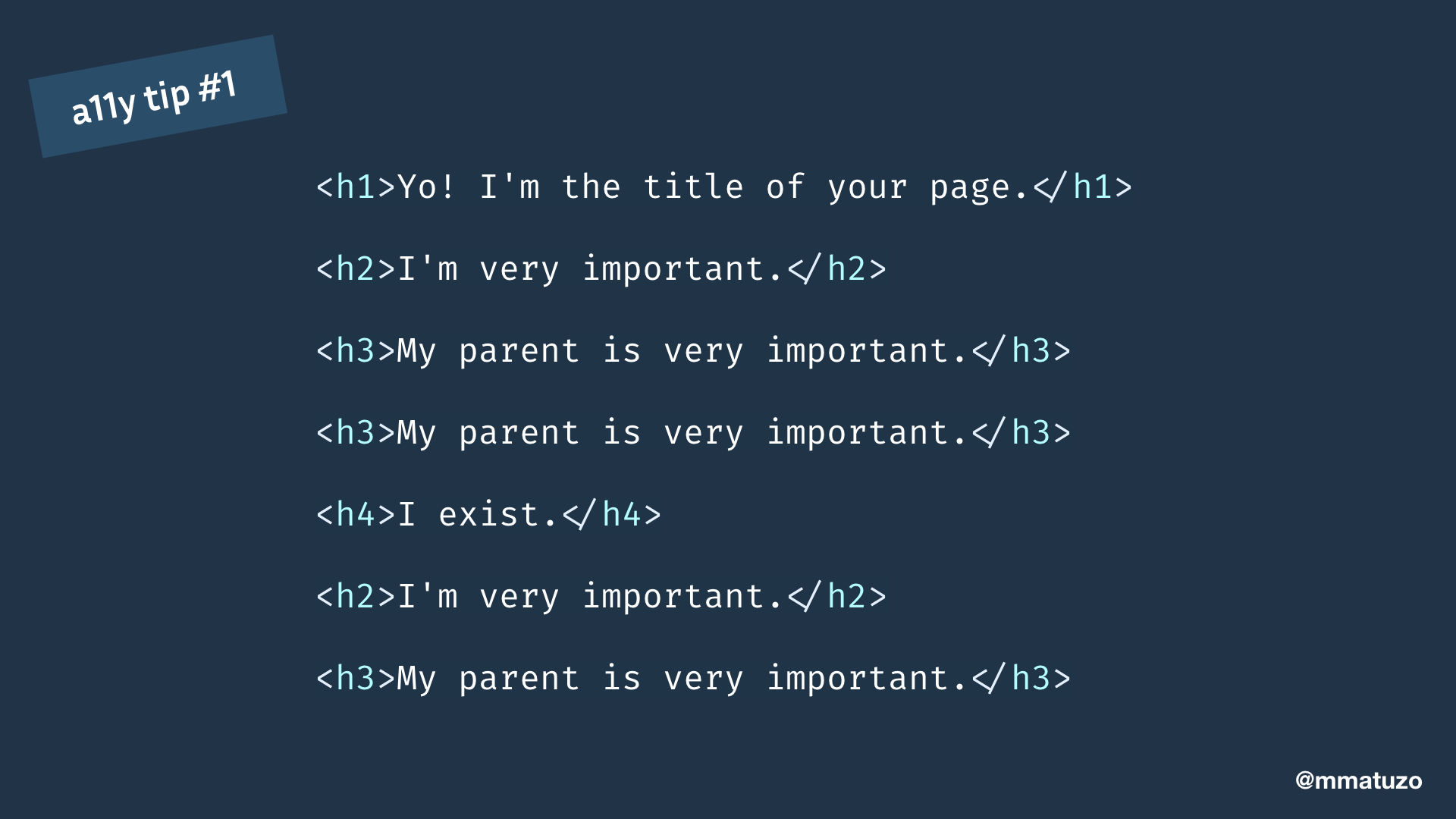
What I mean by that is that you should start your document with an h1 and the title of your page.
Large sections, thematic groupings of content, in your page start with an h2. If there are subsections use h3, h4, etc. If there’s another large thematic section you go back to the h2.
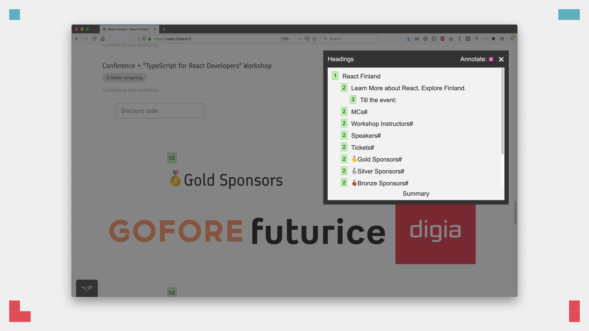
This is important because screen reader users don't just use the software by reading the contents on a page from top to bottom. There are additional ways of navigation, for example by listing all headings and jumping directly to a specific heading.
In VoiceOver you get a list of all headings. The level is announced with the text of the heading to give users context and understand the page hierarchy.
Sometimes that's hard to get right, especially when you're working with nested components. An h2 in a component is correct in one place but might be wrong when it's nested in another.
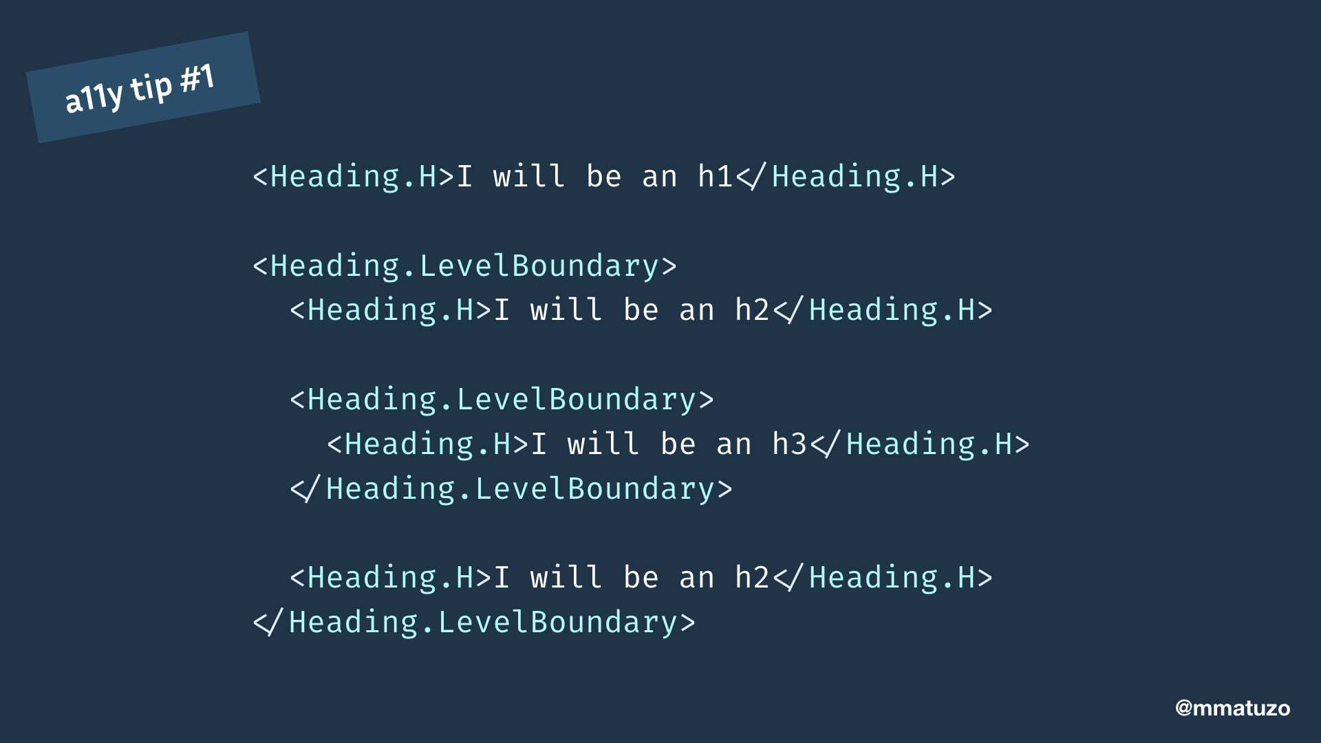
Tenon UI, an accessible React components library, has a component that takes care of that. You start with a Heading.H component which will automatically become an h1 and then you use the Heading.LevelBoundary component to create a new section and allow automatic level calculation.
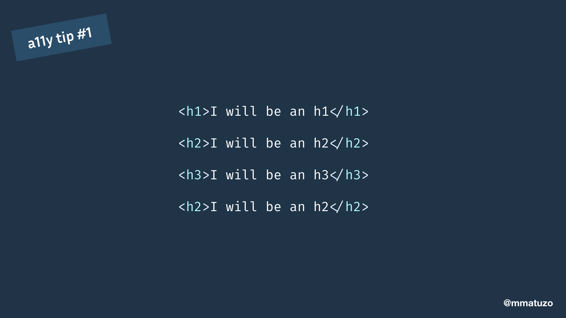
The result is an automatically calculated correct document outline.
There are many ways of testing the document outline. A quick and easy way is a browser extension called tota11y.
tota11y annotates headings and shows the document outline. It displays errors if the outline is not correct.
Summary of the first tip
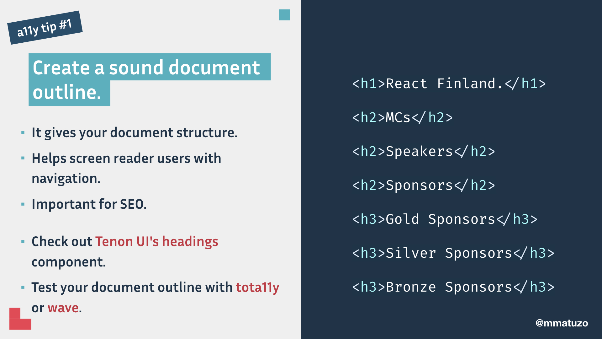
Create a sound document outline because it gives your document structure, helps screen reader users with navigation, and it's important for SEO.
Check out Tenon UI's headings component. Test your document outline with tota11y or wave.
a11y tip #2: Hide content correctly
My second tip is: Hide content correctly.
The React Finland website starts with an h1 and has a well structured document outline. It's almost perfect, there’s just one thing I'd want to improve. There should be a "Sponsors" h2 that groups the different types of sponsorships.
I guess it's missing because it hasn't been considered in the design either. There might be a reason to leave it away in the design but it should be in the document. The design shouldn't dictate the outline but the content should. What we need here is a heading that's hidden from sighted users but accessible to screen reader users.
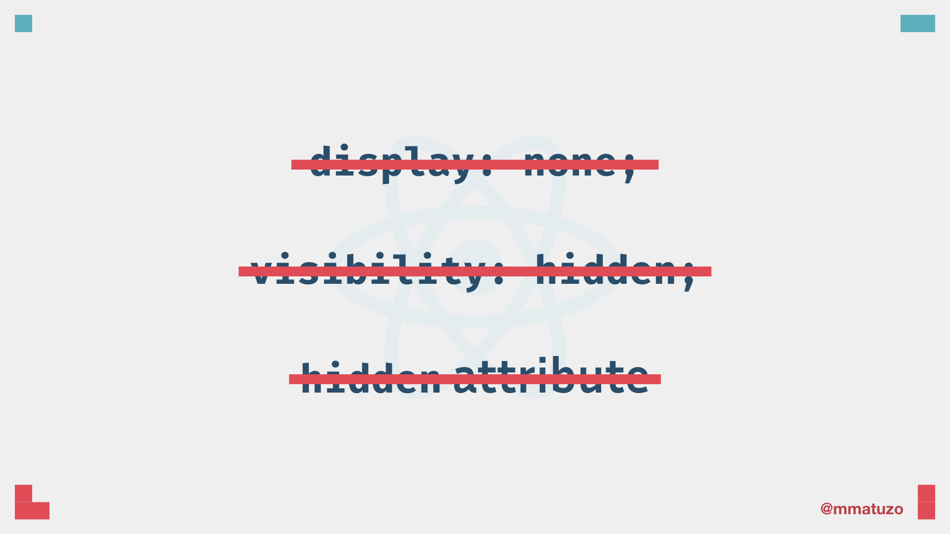
display: none;, visibility: hidden; and the hidden attribute are not suitable for hiding content visually because they remove content from the accessibility tree making it inaccessible to screen reader users.
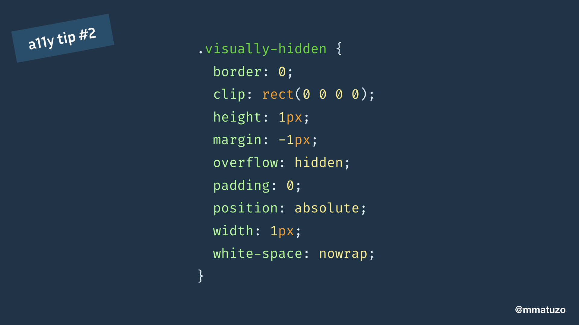
We need a little bit more than that. A combination of properties that makes sure that content is still accessible to screen readers but not visible or focusable.
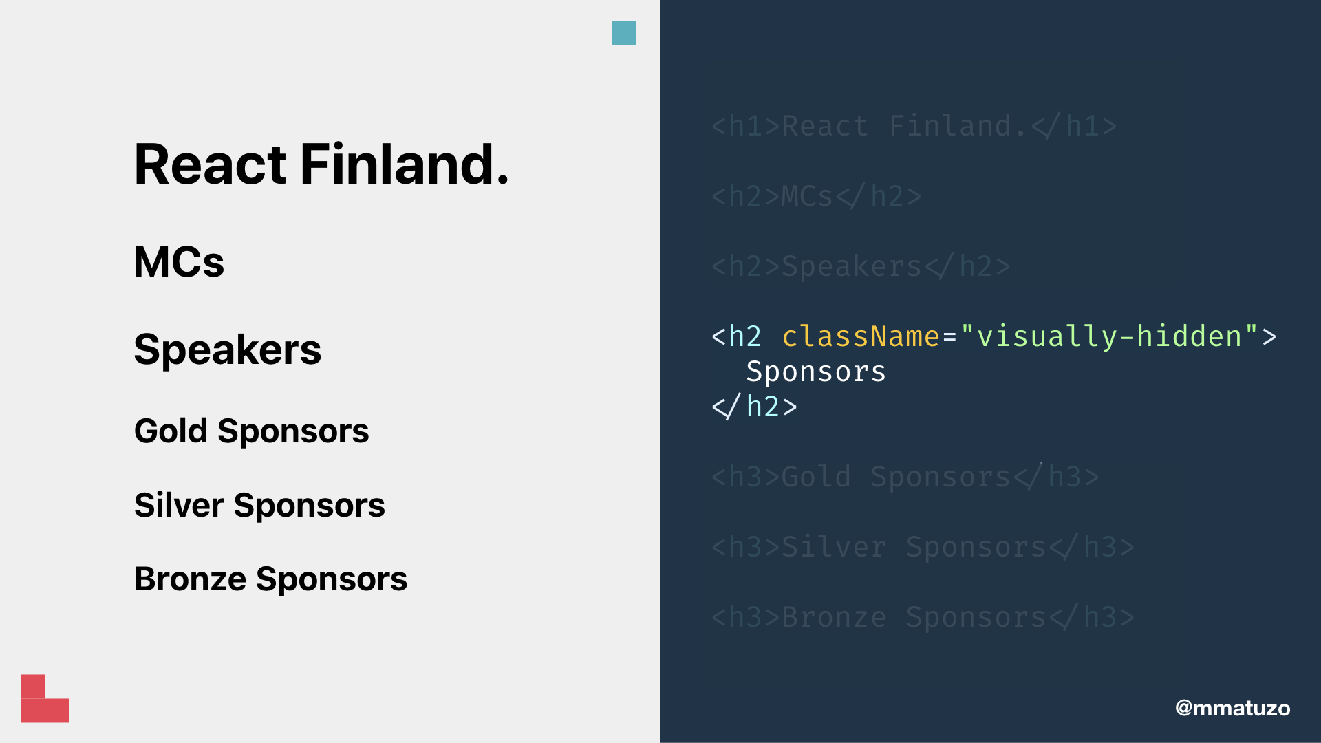
To improve the React Finland website we add a visually hidden h2 and transform the existing h2s to h3s.
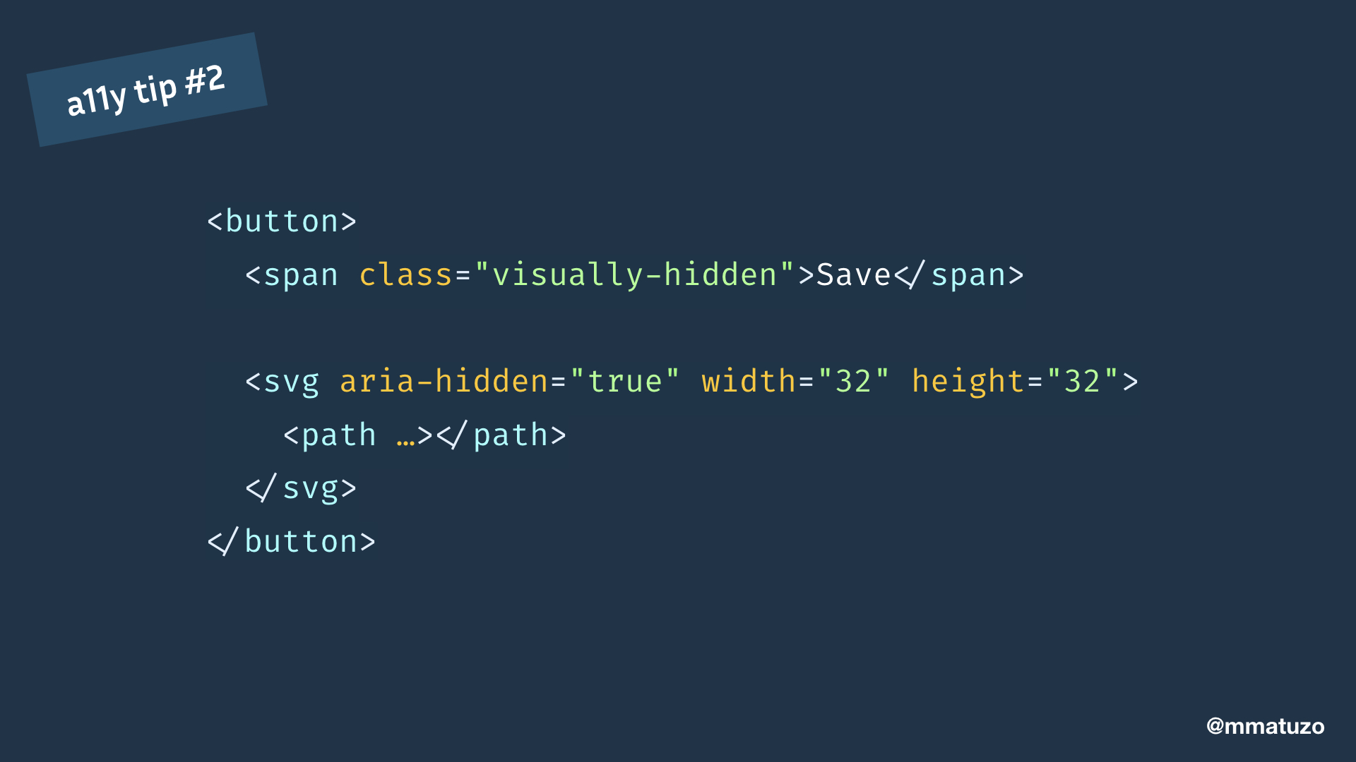
You can use this technique as well when you have an icon button without text. You just put the text in a u-vh span inside the button and you've got yourself an accessible button.
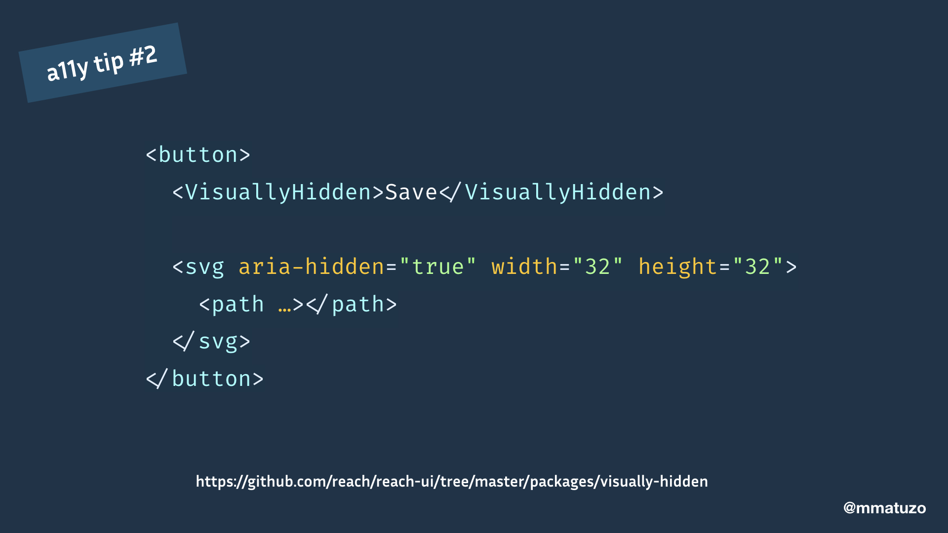
You could write a component for that or use the existing VisuallyHidden component from the Reach UI React library.
Summary of the second tip
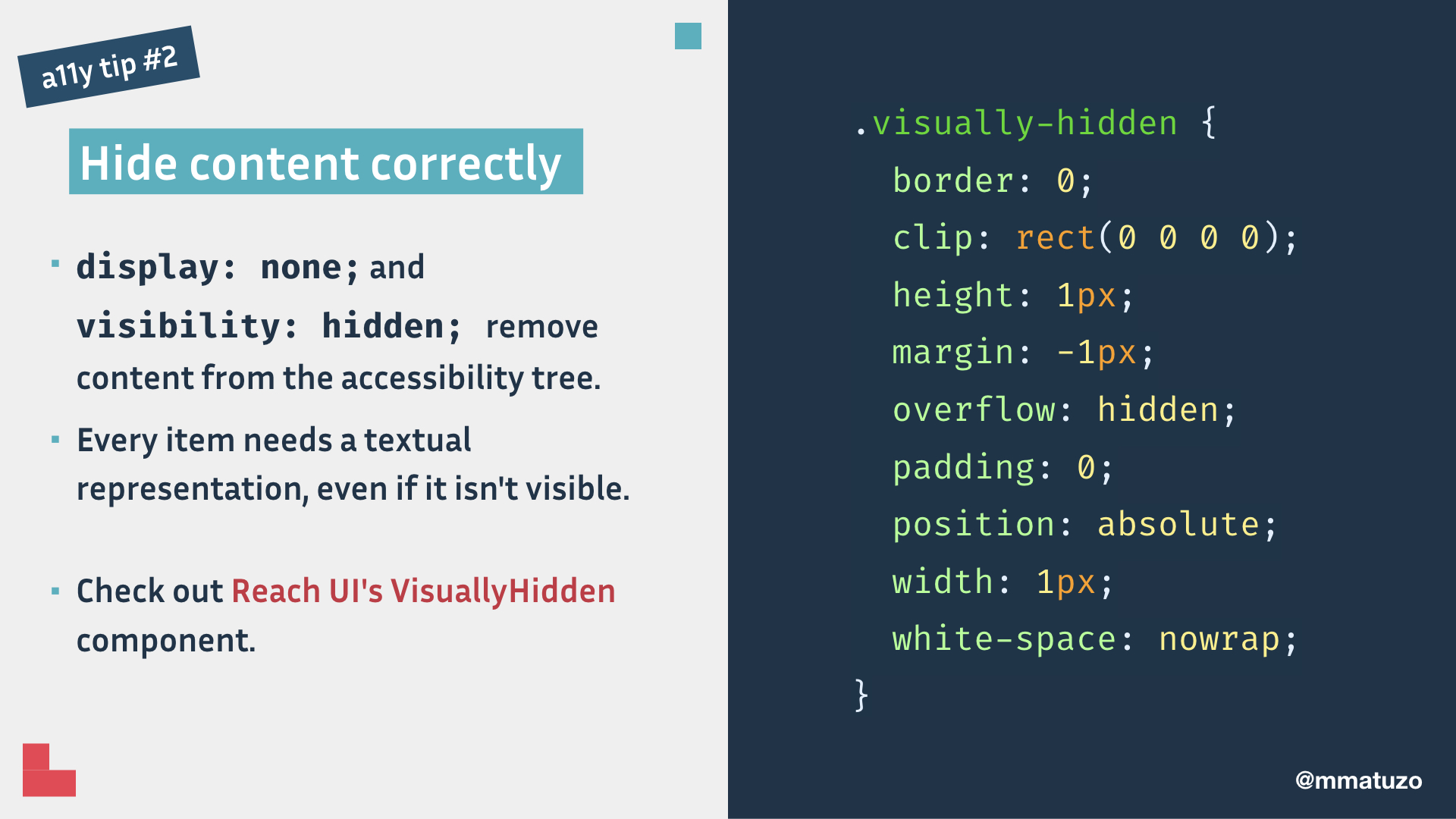
display: none;, visibility: hidden; and the hidden attribute remove content from the accessibility tree.
Every item needs a textual representation, even if it isn’t visible. Check out Reach UI's VisuallyHidden component.
a11y tip #3: Use <button> if you need a button.
Tip number 3: Use <button> if you need a button.
It's tempting to use divs as buttons because they come with less default styling than HTML buttons but there’s a huge difference when it comes to user experience.
I'll show you the difference in the following demo.
In this example I put a click event on a HTML button. You can see that I can click it with a mouse and focus it using the keyboard. I can trigger the event using the mouse or by pressing the Enter or Space key.
This button looks the same but this time I'm using a div instead of a button. I can click the button but I can’t focus it, because divs aren't focusable by default. Even if I could focus it, I wouldn't get the key events I get with the HTML button element.
A fake button is inaccessible to keyboard and screen reader users.
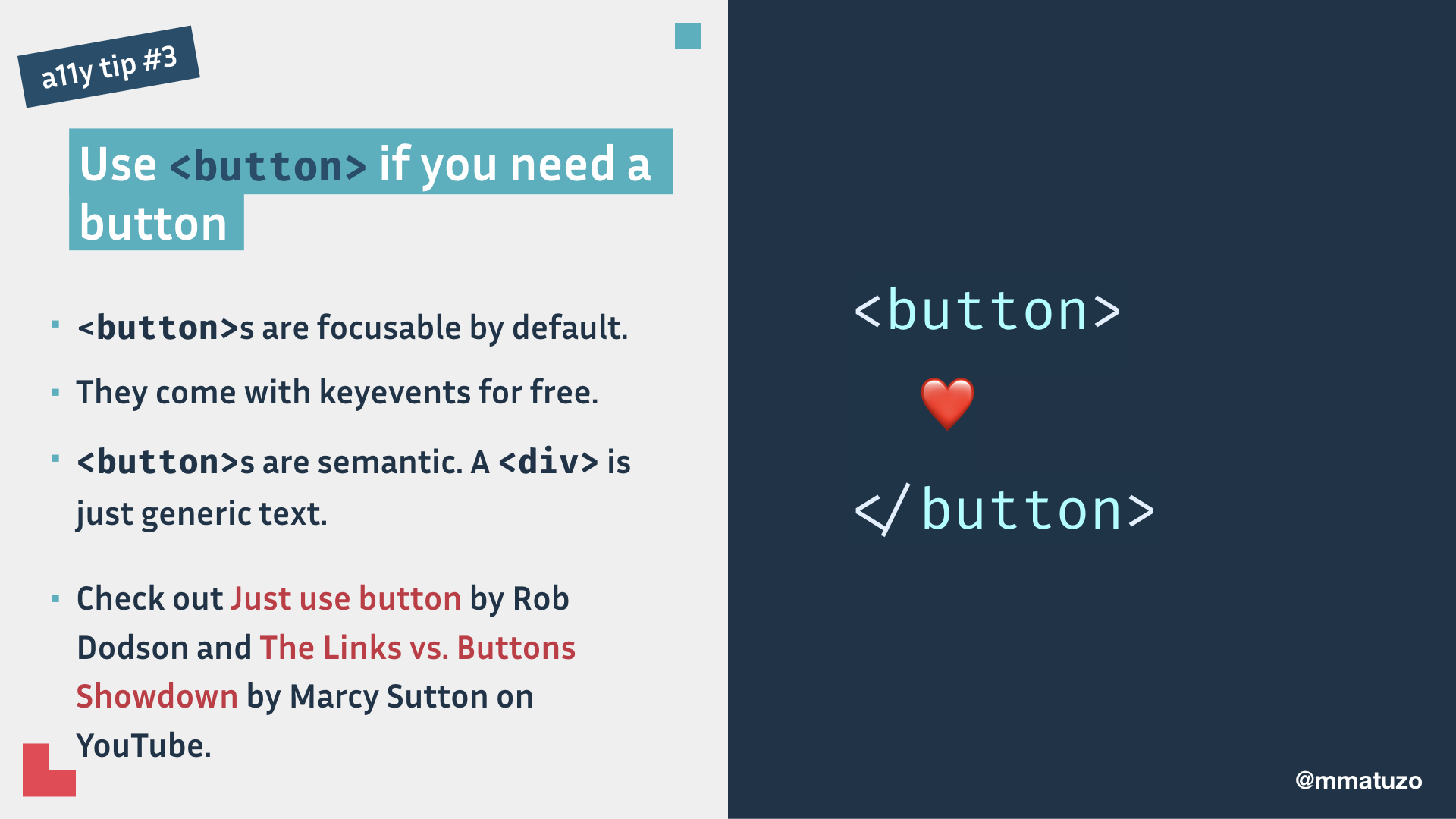
Summary of the third tip: <button>s are focusable by default, they come with keyevents for free and they're semantic. A <div> is just generic text.
Check out Just use button by Rob Dodson and The Links vs. Buttons Showdown by Marcy Sutton on YouTube.
a11y tip #4: Use fragments to avoid invalid HTML.
If a component returns multiple elements, they must be wrapped in a wrapper element, for example a div. This might cause invalid HTML or break your layouts.
React 16.2 introduced a nice little feature called Fragments. Fragments let you group a list of children without adding extra nodes to the DOM.
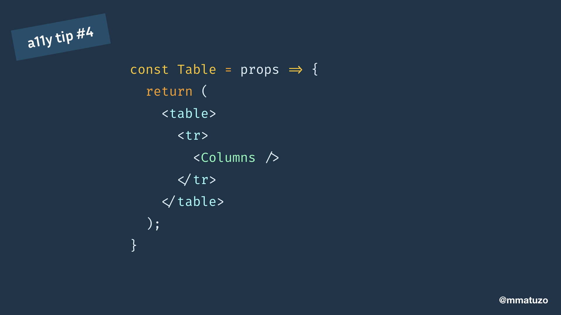
Let’s say we have table component and in each table row there’s a column component.
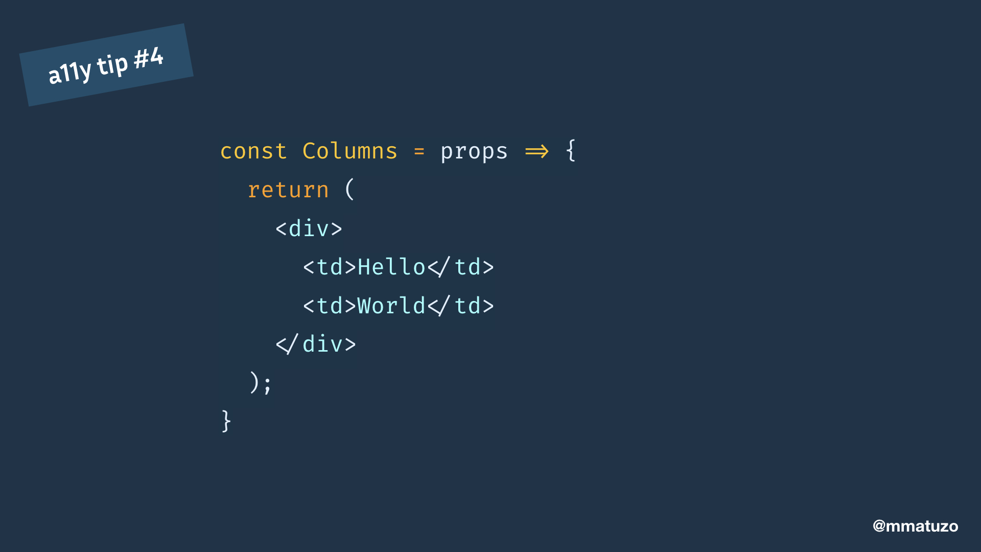
This is how the Columns component looks like. All cells are wrapped in a div because we need a wrapper element.
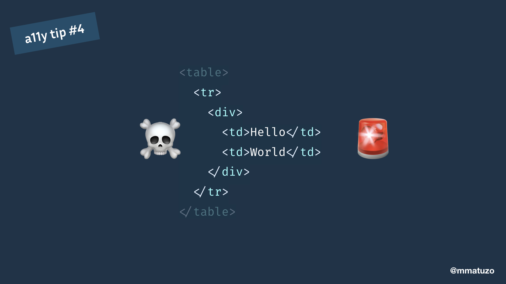
The result is invalid markup because a div is not a valid descendent of tr.
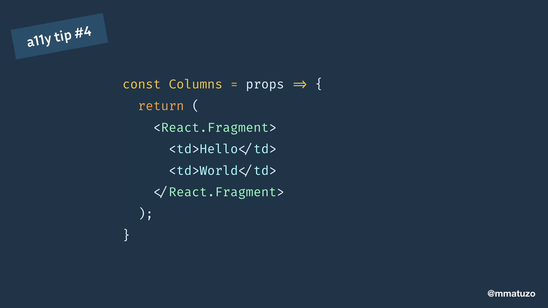
This can be fixed by using a Fragment instead of a div. All you have to do is to replace <div></div> with <React.Fragment></React.Fragment>.
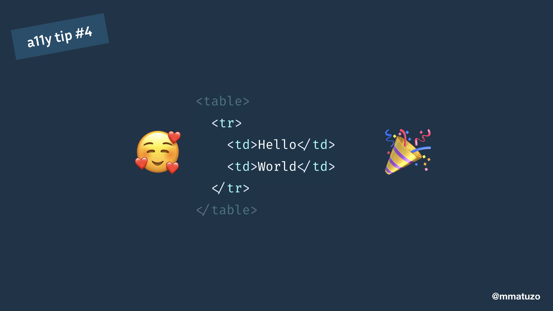
As a result the component returns the contents without extra markup.
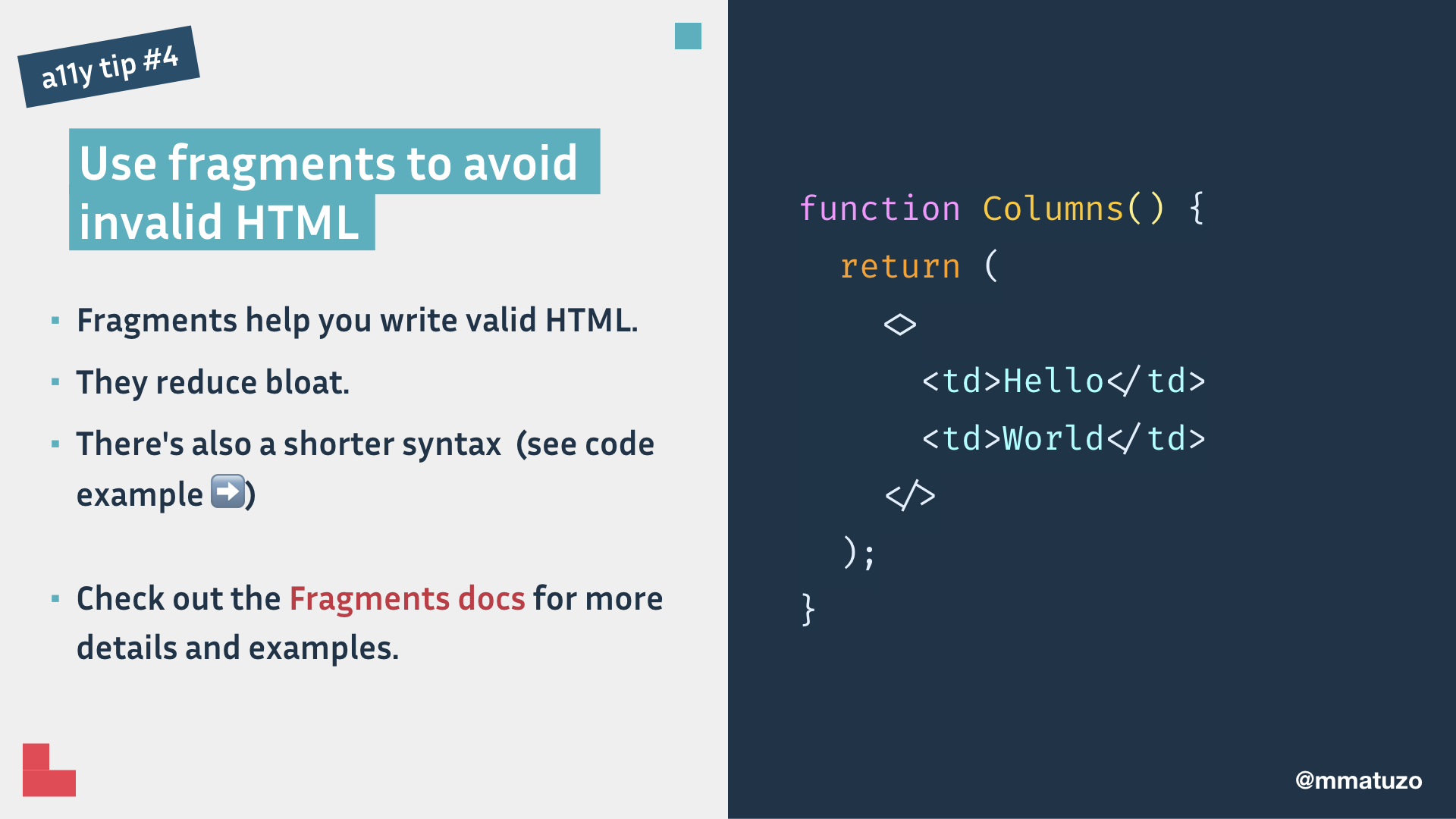
Summary of tip 4: Fragments help you write valid HTML and they reduce bloat. There’s also a shorter syntax, you can write <></> instead of <React.Fragment></React.Fragment>.
Check out the Fragments docs for more details and examples.
a11y tip #5: Take care of focus management.
My fifth tip is that you should take care of focus management.
React applications continuously modify the HTML DOM during runtime, sometimes leading to keyboard focus being lost or set to an unexpected element. In order to fix this, we need to manually move focus in the right direction.
If I focus this button and press Enter, a modal window pop ups. I would expect that I can access the content in the modal with my keyboard. Instead the focus is still behind the modal window because tab order always follows DOM order and the modal window is at the very end of the page. I'd have to tab through all items on the page until I reach the modal.
This is a situation were we have to move focus manually from the button to the modal window.
If we do that, we can access the elements in the modal by pressing the Tab key as we would expect it. Of course, if the user closes the modal, we have to make sure to move focus back to the button.
To set focus in React, we can use refs.
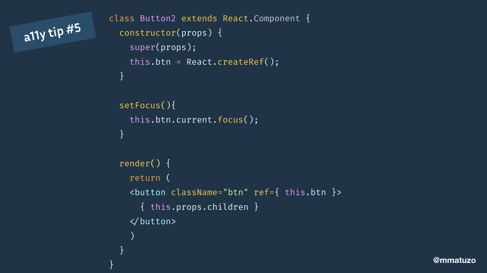
- First we create a ref using React.createRef().
- We attach the ref to a DOM element, in our example a button, via the ref attribute.
- This gives us access to a reference to the node.
- Now we can focus the button using the raw DOM API.
Not taking care of focus can be a real problem.
On vice.com the focus should be on this dialog when the site is accessed for the first time to allow users to close it but instead it's behind the modal and keyboard users have no chance to interact with it. Neither pressing Tab nor pressing Escape will help.
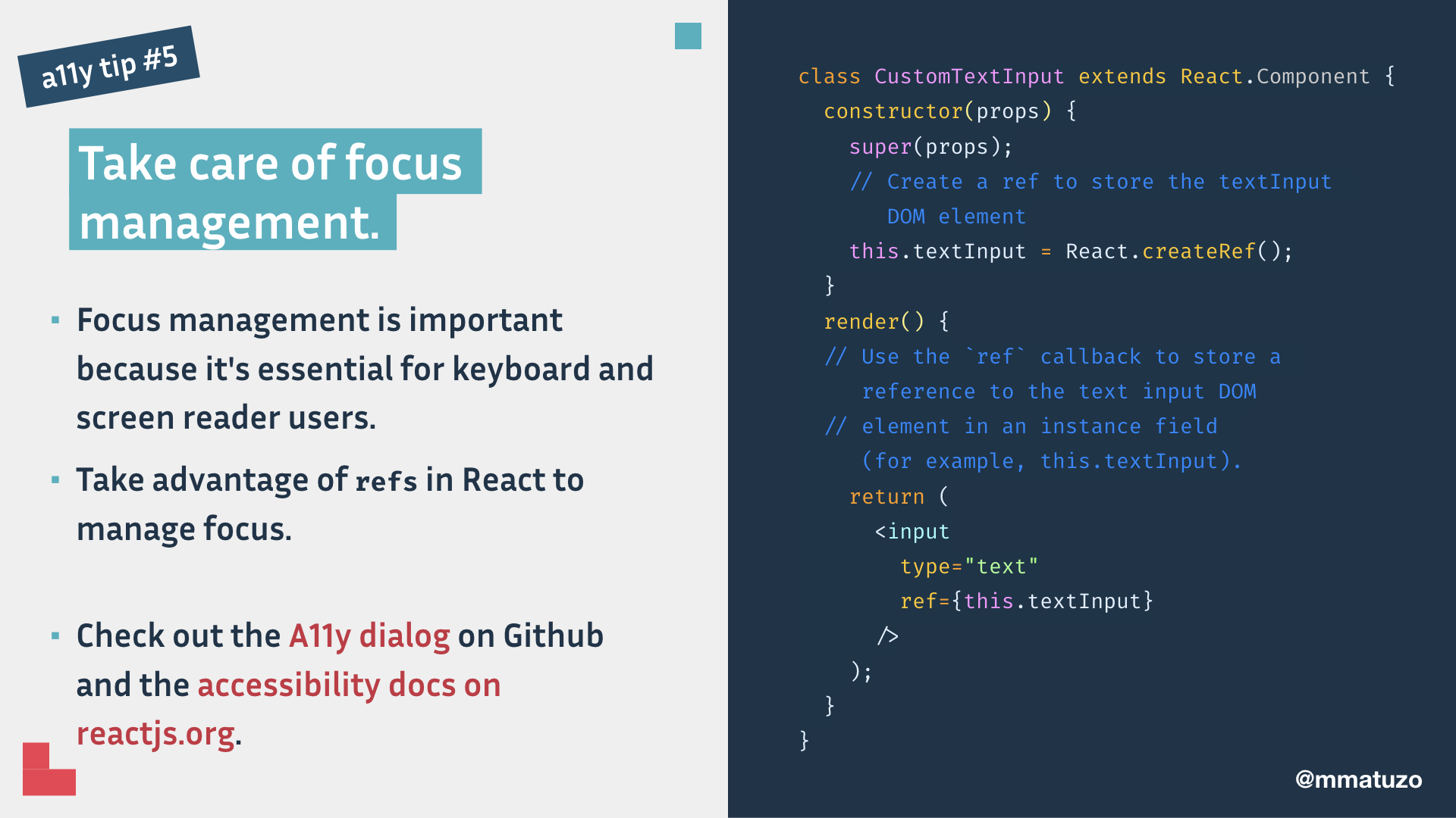
Summary of tip 5: Focus management is important because it's essential for keyboard and screen reader users.
Take advantage of refs in React to manage focus.
Check out the A11y dialog on Github and the accessibility docs on reactjs.org.
a11y tip #6: Make notifications accessible to everyone.
Tip number 6: Make notifications accessible to everyone.
I'm using VoiceOver on this page. If I click the button, a notification pops up that tells me that everything has been saved successfully.
The problem is that there’s only visual feedback. The app doesn't provide screen readers with the information.
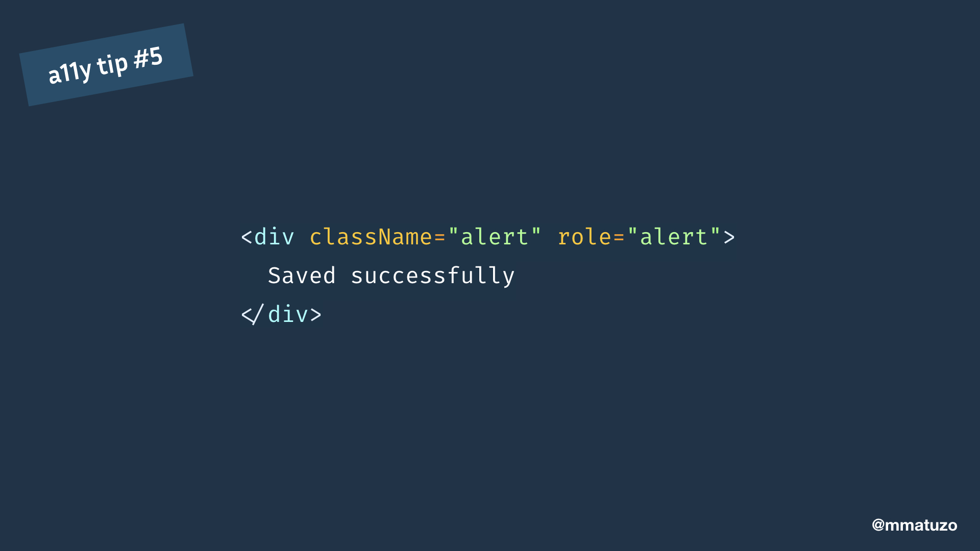
The notification looks something like this. In order to make it accessible we have to add one more attribute.
If an element has the role attribute with alert as a value, it becomes a live region. Screen readers will than watch and announce content that has changed inside this element.
And now, with the role attribute in place, the notification will be announced.
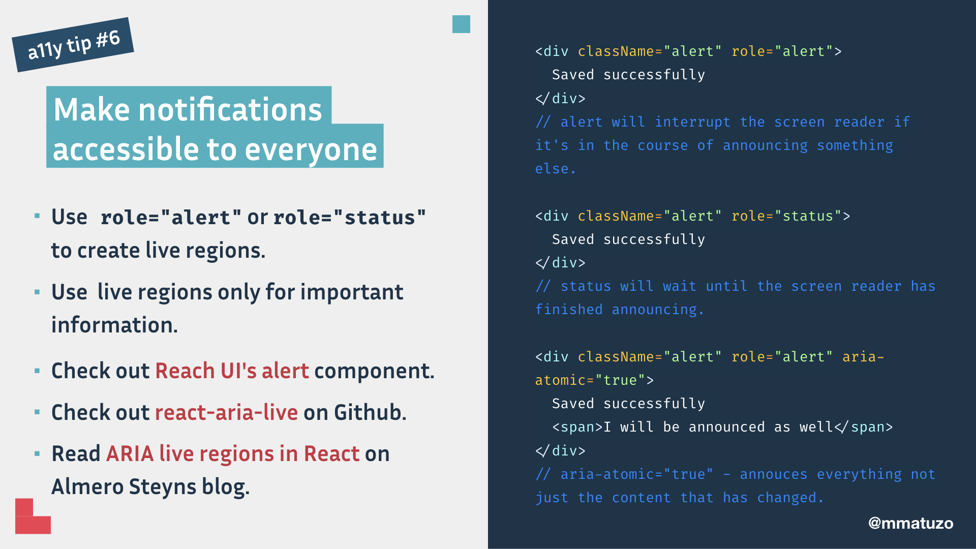
Summary of tip 6: If you add role="alert" or role="status" to an element you're transforming it to a so called live region.
The difference between alert and status is that alert will interrupt the screen reader if it's in the course of announcing something else. status will wait until the screen reader has finished announcing.
Use live regions only for significant changes that you need to communicate.
Check out Reach UI's alert component, react-aria-live on Github, and read ARIA live regions in React on Almero Steyns blog.
a11y tip #7: Announce page changes.
Tip number 7 is important: routing. If you use a screen reader on a server side rendered page and you click a link, the whole page loads, the title of the page is announced and the focus is on the document. With single page applications that's a little bit different.
If I tab to the "about" link the screen reader announces the text in the link. When I click it, the page changes but the screen reader doesn't announce the change and focus stays where it is.
The issue with the fact the focus doesn't move is especially visible if I click a link in the footer. I'm on the "about" page, I tab down to the footer links and click the "blog" link. The content of the page changes but I don't hear and see it.
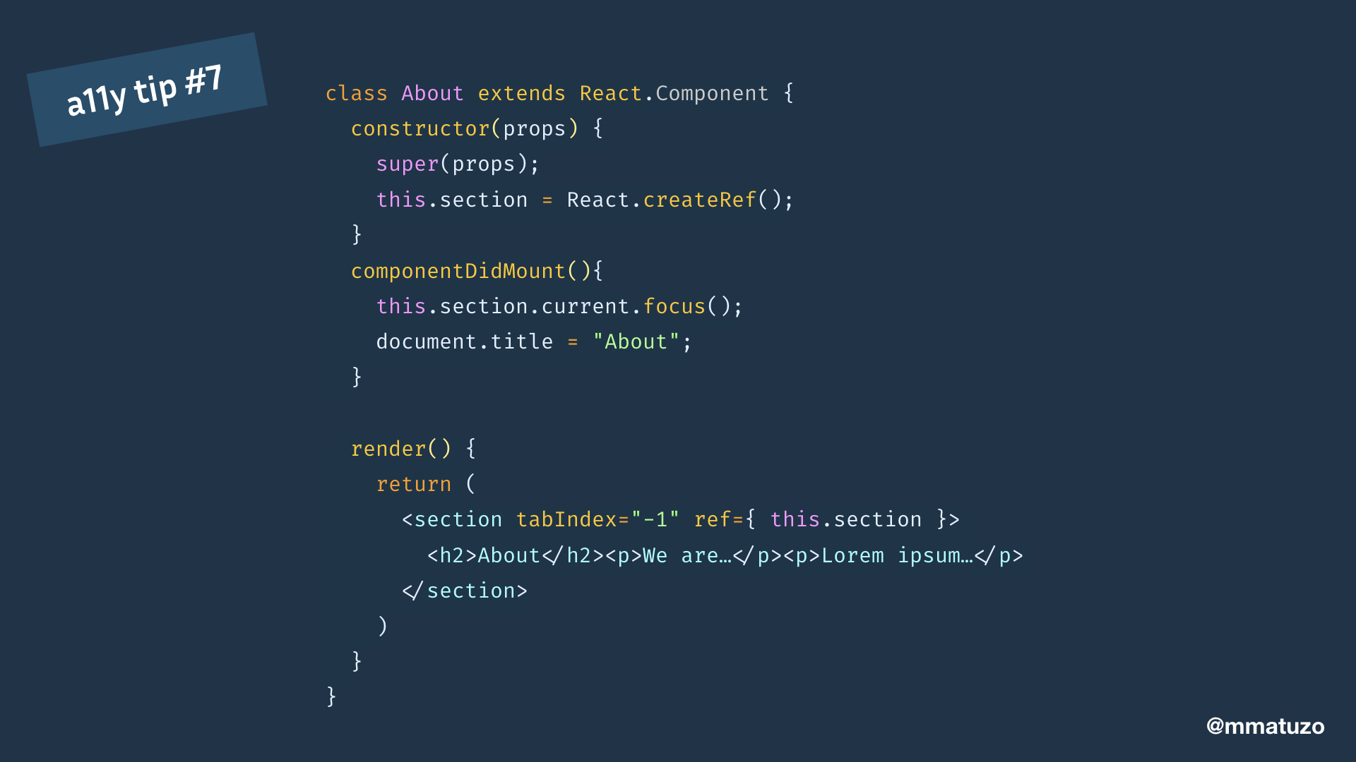
In order to fix it I again create a ref. This time to get access to a reference to the section DOM element.
I add the tabindex attribute with the value -1 to make the section focusable. I focus it on componentDidMount.
And while I'm at it I also update the document title.
VoiceOver will now announce the whole region, so the heading and the text. I'm not sure if this is the best way to do it, I prefer to be as close to the native behaviour as possible. That's why I want to announce just the title of the page.
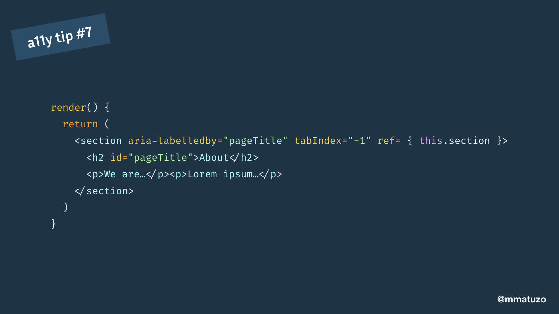
One way to do that is to label the focused region with the text in the heading.
I give the heading an id and reference it in the section by adding the aria-labelledby attribute with the id as a value. Now the section is labelled by the content of the heading. The difference is that screen readers will on focus just read the content of the heading instead of everything.
If I do all that, the focus moves to the section, announces the content of the heading as well the information that focus is on a region.
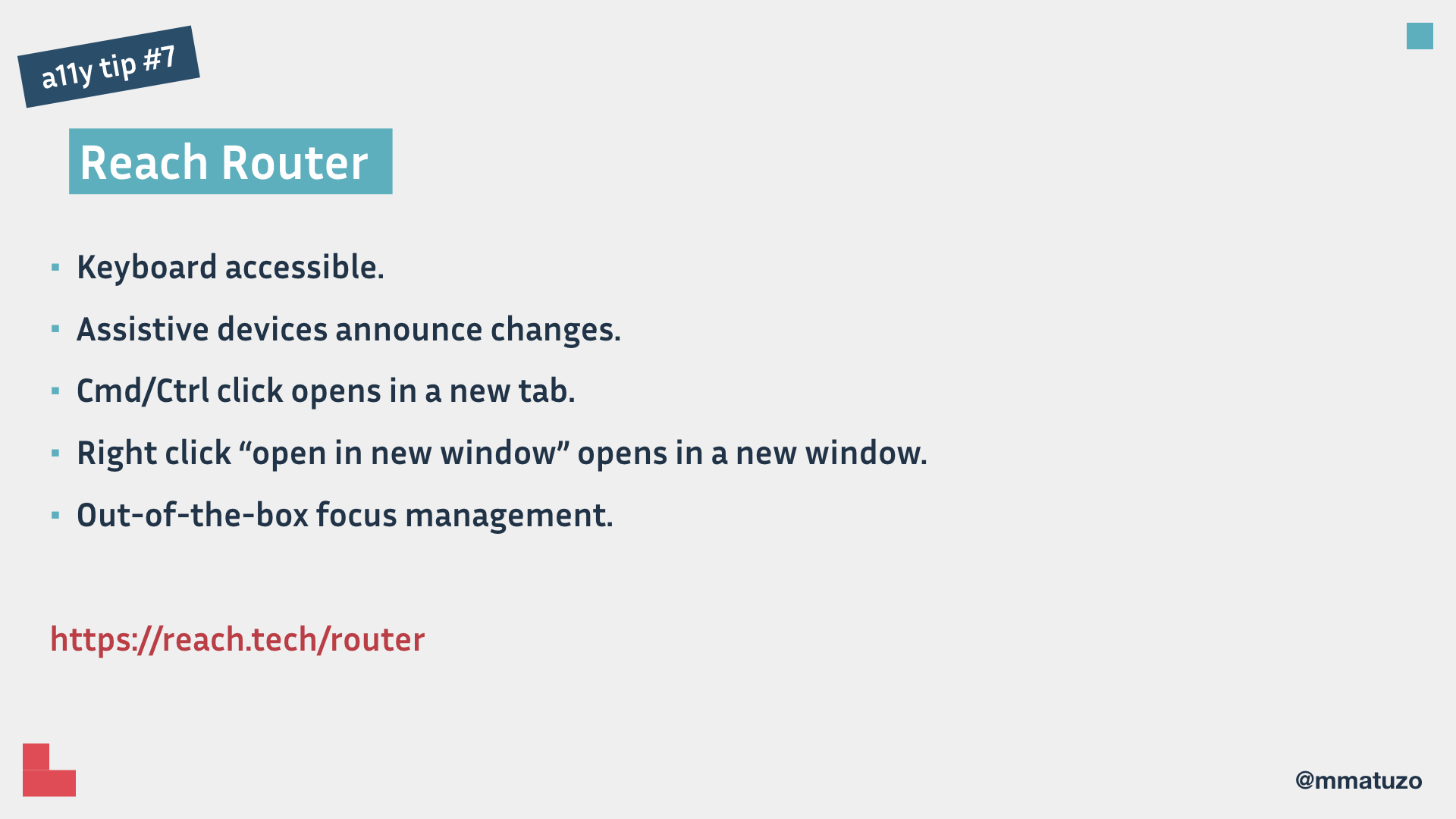
There’s a router called Reach Router that does these things and more out-of-the-box.
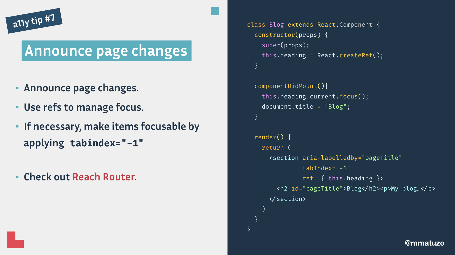
Summary of tip 7: Announce page changes. Use refs to manage focus. If necessary, make items focusable by applying tabindex="-1"
Check out Reach Router.
a11y tip #8: Test your React code automatically.
My last tip, tip number 8: Test your React code automatically.
Don't get me wrong, you have to do manual testing as well, but automatic testing is a good first step.
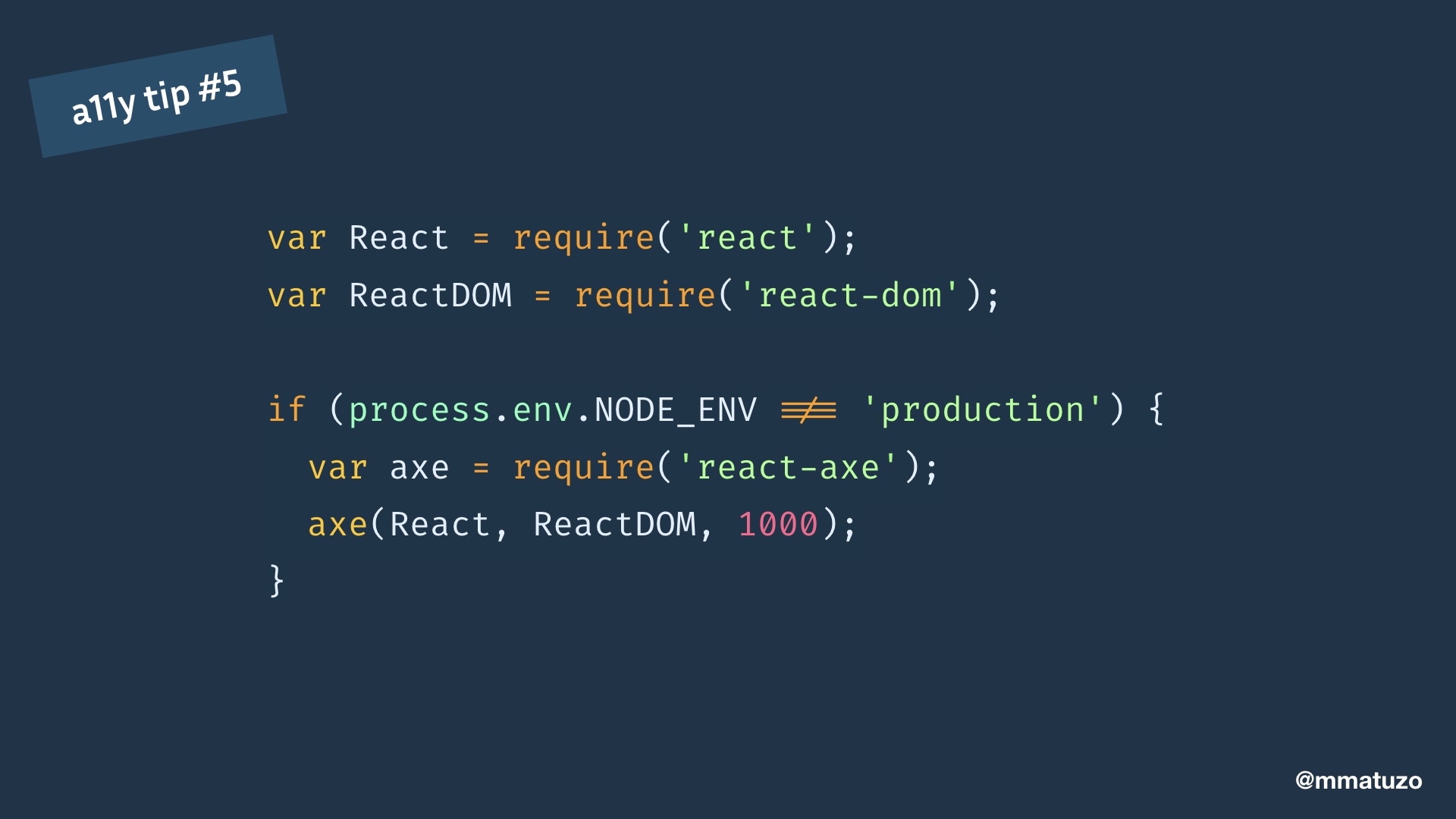
There’s a great tool called React-Axe. It uses the axe-core accessibility testing library. Results will show in the Chrome DevTools console.
Call the exported function passing in the React and ReactDOM objects as well as a timing delay in milliseconds.
Be sure to only run the module in your development environment.
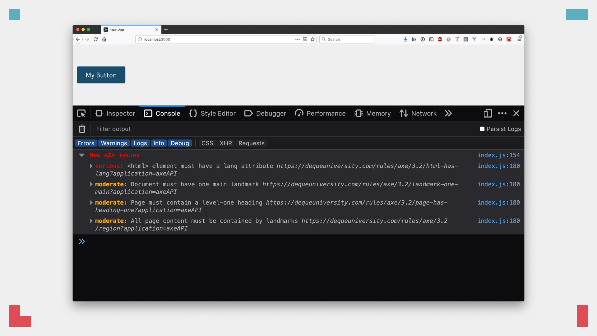
The advantage compared to other tools is that react-axe tests the accessibility of the rendered DOM.
If you open the console of your dev tools you'll see the errors that axe has detected. For example, the <html> element must a have a lang attribute, because it defines the natural language of the document.
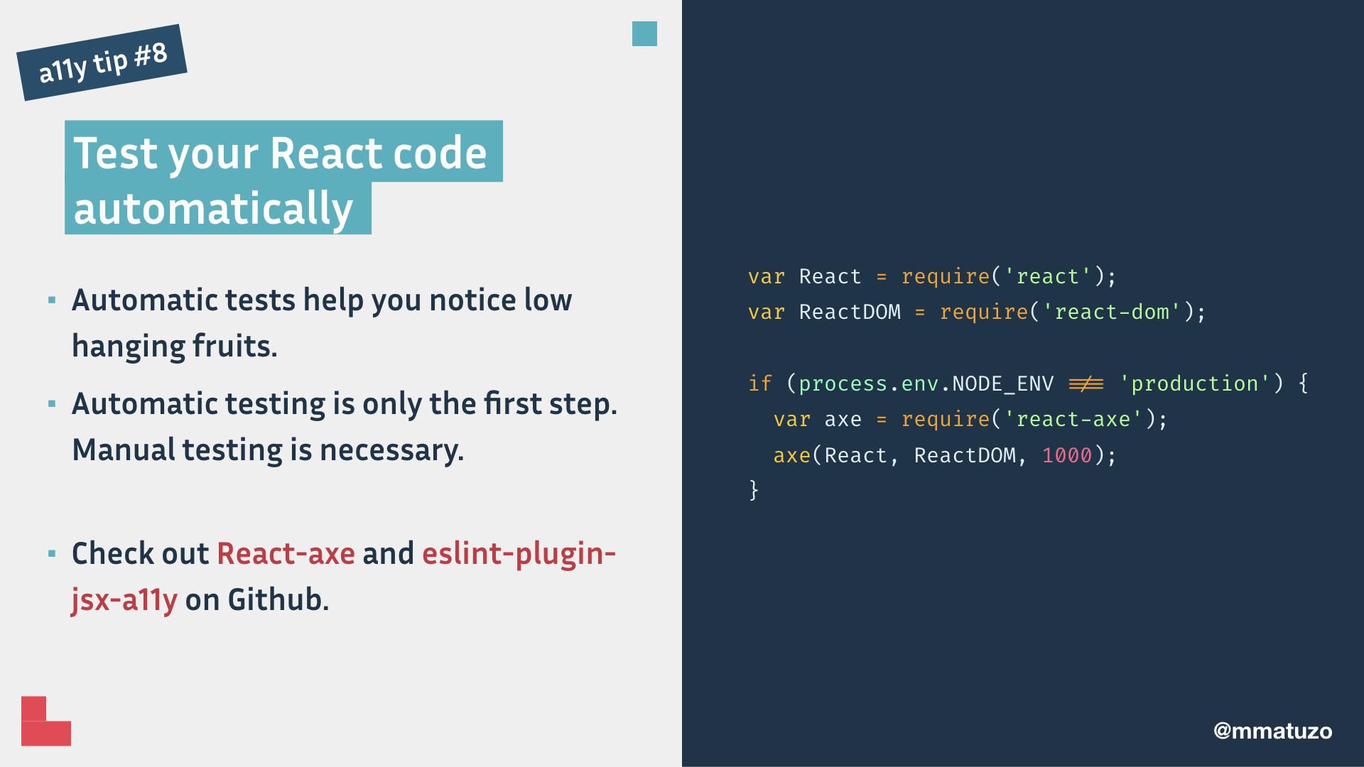
Summary of tip 7: Automatic tests help you notice low hanging fruits. Automatic testing is only the first step. Manual testing is necessary.
Check out React-axe and eslint-plugin-jsx-a11y on Github.
Thank you ❤️